There are a few similarities between VAMFF 2019 and the Titanic, they both catered to a versatile population, showcased design of multiple influences and aesthetical directions and the music played on up until the end. One major difference is that VAMFF 2019 didn’t just stay afloat it sailed into and through the 2019 Australian Fashion calendar with flair and a sophisticated cargo.

I would like to take you through a selection of Melbourne My Styles favourite collections for the week.
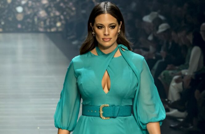
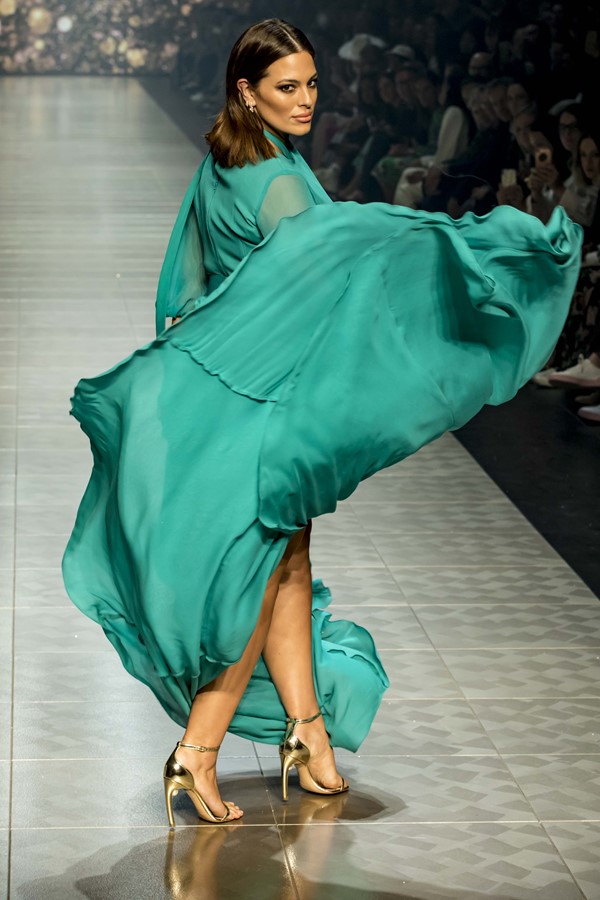
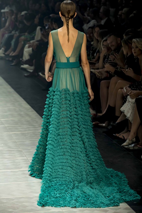
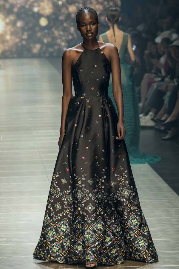
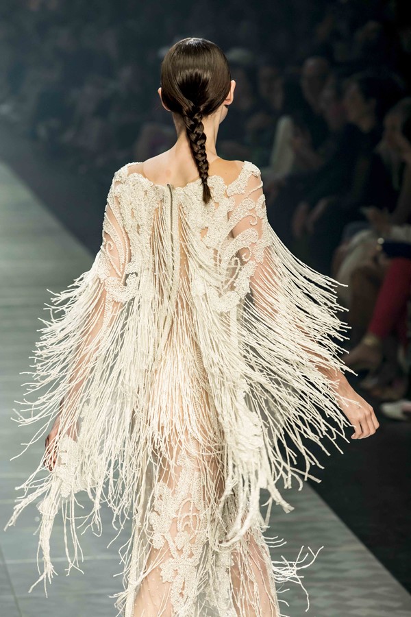
Let’s start with JASON GRECH, seen on Runway 4. Jason presented a new look for the label this year, his attention seeming to be on producing a collection with a higher volume of commercial outcomes this season.
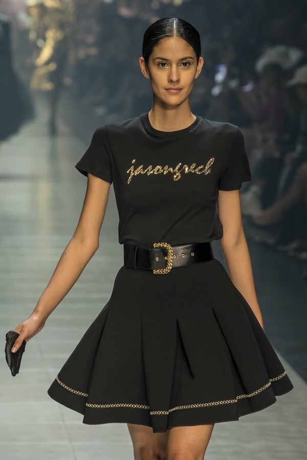
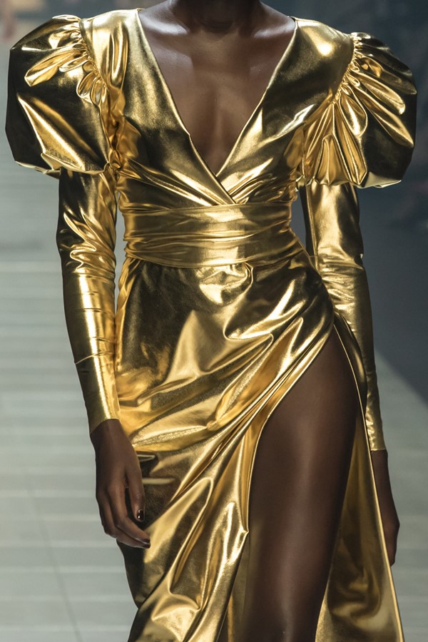
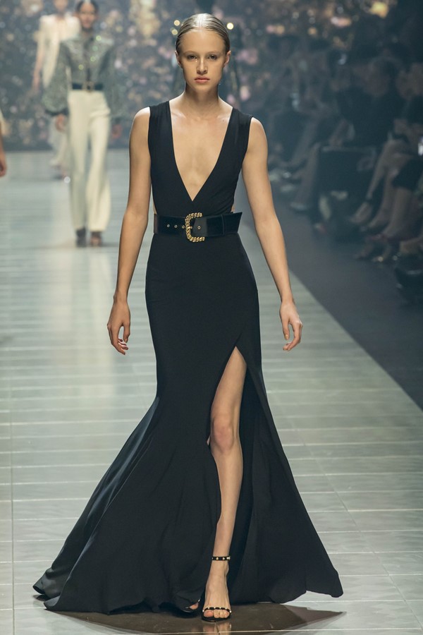
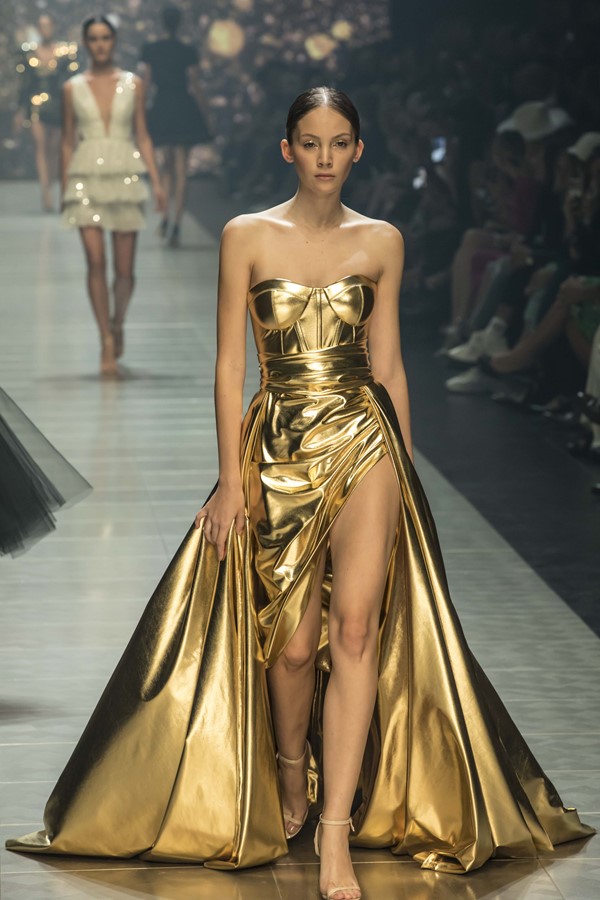
His colour-way seemed to be extracted straight out the history books from ancient Egyptian and Roman times. Models walked the runway in gleaming gold draped gowns, nude shears that have been opulently hand beaded with glass eggshell coloured beads. Gowns of ravishing emerald greens that had covered in hundreds of miniature ruffles, created textures not dissimilar to how crystals form along the walls of caves, dull to oily blacks highlighting the collection in all of its well-refined glory.
LEO & LIN hit Runway 4 showcasing their whimsical, feminine and dreamy collection full of buttery tones in soft lemon yellows, pink melons and powder blues. The collection incorporated many architectural feats by using a combination of lacework, pleating, print and drape across multiple bodies. The outcome was refreshing and mouth-watering.
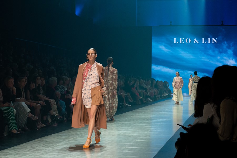
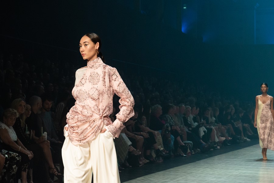
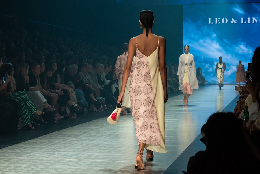
There is one element to this particular label that has the edge to all of its competitors, the wonderful use of storytelling. This relatively young brand has found its niche in the art of deriving its elements and principles of design from a conceptual starting point. As an observer, we may not fully understand this initial starting point but it is easy to see that there is one, as this collection would have been one of the most cohesive and well-narrated collections of the week.
Melinda and I were very lucky to have seen the THURLEY collection twice, first on Runway 4 but then again at the Malvern Town Hall at the High Tea on Saturday. The Town Hall was the perfect building to see their new collection as the historical design elements within this prodigious historic building resonated with the many garment construction techniques that had been pulled from antiquity and utilised within the THURLEY collection.
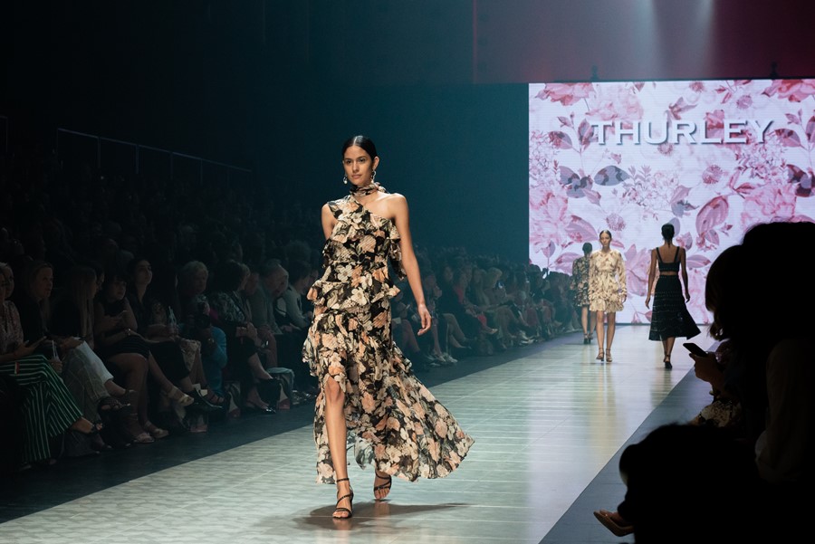
A lecturer of mine long ago once told me that those who know their history are always the better designers. Those responsible for the current THURLEY collection are to be applauded. The collection was a Gasconade of multiple fagoting and corsetry lacework techniques from as early as the 1600s. The elements of design extracted from the effortless concept of the butterfly, clearly seen within the silhouettes and fabrication choices throughout the collection.
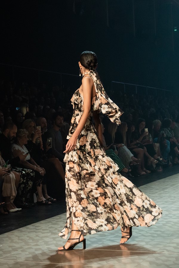
The narrative was one of enchanted femininity that hinted towards a darker and somewhat mysterious sense of medieval torment through the use of black tone that had been injected into the collection.
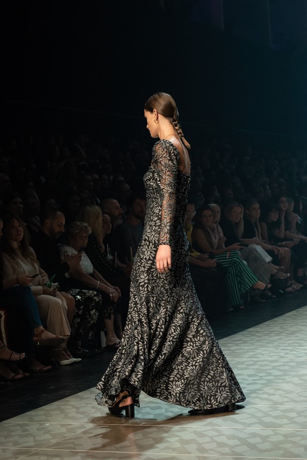
Melbourne My Style would like to congratulate Helen O’Connor, THURLEY’s Creative Director on her inclusion into the Stonnington Fashion Hall of Fame.
It would be like Noah missing his boat if I didn’t report on the GQ Menswear runway, held once again in the awe-inspiring Royal Exhibition Building featuring an incredibly eclectic range of contemporary menswear designers.

The list of designers including Strateas Carlucci, MNDATORY, MJ Bale, Chris Ran Lin, Christian Kimber, Dom Bagnato, bassike, Jac & Jack, Client Liaison Deluxe Line.

The GQ runway was one I had been anticipating since the release of the designers who were participating in the showcase. My first thought was actually one of curious concern; how indeed will they manage to curate such a diverse number of aesthetics into one cohesive exhibition of menswear?

The show featuring everything from casual streetwear boasting block tertiary colours over slightly oversized silhouettes with the use of one bold bright orange by bassike. To the inclusion of the traditional three-piece full tailored suits that have been made contemporary through the pairings of fresh new colourways. Notably dark plums and hints of fuchsia placed with traditional textures and prints by Dom Bagnato.

From the list of profoundly accomplished designers, who are the leaders of innovation and positive change? Gentlemen; if you are looking to purchase garments that put you on the cutting edge of contemporary design and fashion engineering, these next two labels are ones I would like to draw your attention to. Strateas Carlucci and MNDATORY.

Let’s start with Strateas Carlucci. I was terribly impressed with this collection on a number of levels. This collection reports on current socio-trends that are happening globally, specifically the significant changes towards binary fashion. Showing men wearing fabrications and colourways traditionally sanctioned for those with the female form. My favourite look was a black stretch velvet turtle-neck paired with a bubble gum pink textured knee-length overcoat and a skinny leg charcoal trouser worn by a tall, slender soft featured male model, styled with white cowboy boots. This look along with many others was a really refreshing take on non-binary contemporary fashion.

As the models came out from behind the wall one by one, I noticed a compelling shift in silhouette and ocular texture as the name on the wall changed to MNDATORY. I found myself sat on the edge of my chair, squinting towards each look as it passed me. I was in desperate need not to miss any of the hidden details. Showcasing a beautiful combination of visual textures demonstrated through the use of small geometric print and larger organic print. The collection also boasting large oversized stripes. These unique print combinations were supported by the intelligent use of structured, semi-tailored pieces with non-structured knits, creating a sophisticated, refreshing and cool, masculine aesthetic.

Going back to my original question; how will GQ curate so many varied collections into one final cohesive showcase successfully? Watching the GQ menswear runway was more like ready a well-written book. Each collection representing one chapter, holding its own whilst segueing into the collections that both preceded and succeeded through the rational selection of using either colour, texture, silhouette or music to subtly move the viewer through the GQ story.
Todd Anthony
Cover Photo by Sam Tabone, featuring Ashley Graham in Jason Grech

